Generating and visualizing data from a sine wave in Python
25 May 2016 ▪ 0 CommentsSo the objective here is to generate sequential data from a mathematical function - a sine wave is used in this post. Also, the goal is to use Python to do this. We are going to sample a sine wave at a pre-defined interval and dump it to a file for future use in other Python scripts.
Starting with the imports:
import matplotlib.pyplot as plt
import numpy as np
import pylab
import pickle
We will use these modules to get our work done.
- matplotlib.pyplot to plot and visualize the data
- numpy to generate the mathematical function
- pylab to help with interactive plots
- pickle to dump the data into a file for future use
Next, we set our range for the x-axis and define our functions.
xlim = 40

# define functions
x = np.arange(0, xlim, 0.1)
y = np.sin(x)
This will generate two lists x and y with our x-axis and y-axis data.
We'll now dump the y-axis data into our file for future use.
# write the data out to a file
sinedata = open('sinedata.md', 'wb')
pickle.dump(y, sinedata)
sinedata.close()
The above snippet writes the data of y into a file named sinedata.md. Pickle is specific to Python and it can be used to load the data into another Python script later.
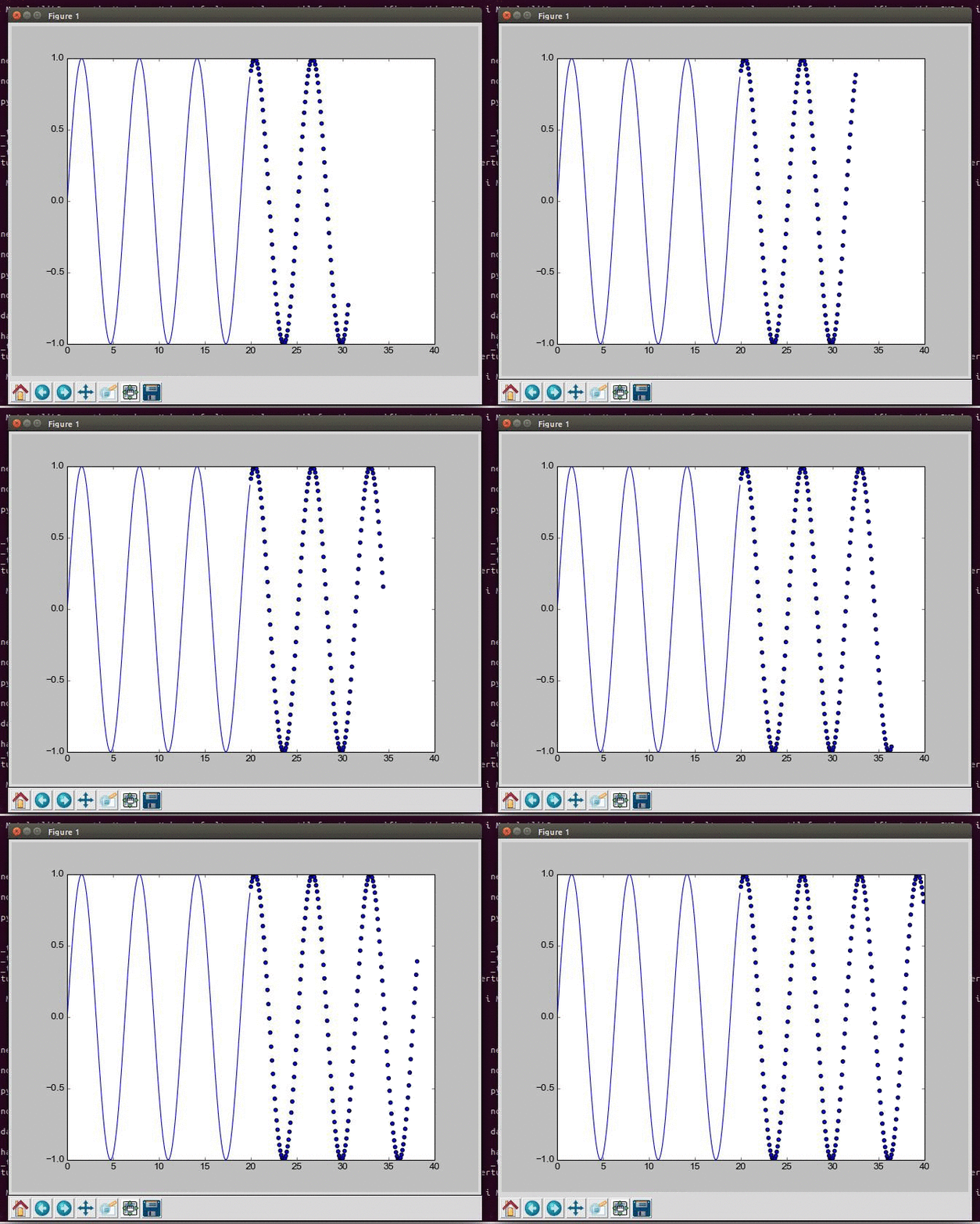
Next, we will visualize the data. Here is the code to do this:
# interactive mode on
pylab.ion()

# set the data limits
plt.xlim(0, xlim)
plt.ylim(-1, 1)

# plot the first 200 points in the data
plt.plot(x[0:200], y[0:200])
# plot the remaining data incrementally
for i in range(200, len(y)):
    plt.scatter(x[i], y[i])
    plt.pause(0.0005)

# hold the plot until terminated
while True:
    plt.pause(0.5)
I think the comments in the snippet do a good job at the explanation. The plot will look something like this:
